
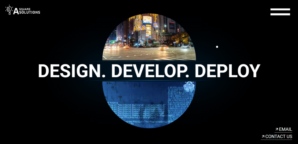
A SQUARE SOLUTIONS — Our Original HTML/CSS Website: From Hand-Coded Pages to a Content-First CMS
When we launched A SQUARE SOLUTIONS, we started as many hungry digital studios do — with an index.html file, a folder of images, and a belief that clean code wins. Our original HTML/CSS website wasn’t just a placeholder: it was a statement — fast, fully custom, and built to showcase design chops in the simplest, most durable form.
Our Foundation: The Original A SQUARE SOLUTIONS Website
Exploring A Square Solutions’ History: From HTML to WordPress
At A Square Solutions, we’ve come a long way since our humble beginnings. Our original HTML/CSS website was a game-changer in its time, showcasing our commitment to custom design and scalability.
In this article, we’ll take a trip down memory lane and explore how we first went live with our fully coded HTML/CSS website. From the early days of web development to our transition to WordPress, we’ll cover it all.
Why we chose HTML/CSS first (and why it mattered)
In the early days, agility mattered more than bells and whistles. A hand-coded site gave us three immediate advantages:
Performance: No plugins, no heavyweight themes — just HTML, CSS and a little JavaScript. Pages loaded instantly on slow connections.
Control: Every design detail was ours. No theme overrides, no unneeded dependencies.
Simplicity: Editing meant changing a single file or two — perfect for a small team moving fast.
For startups and solopreneurs, those tradeoffs are often the right ones: speed of iteration and minimal hosting costs can beat scale-ready complexity.
What We Did
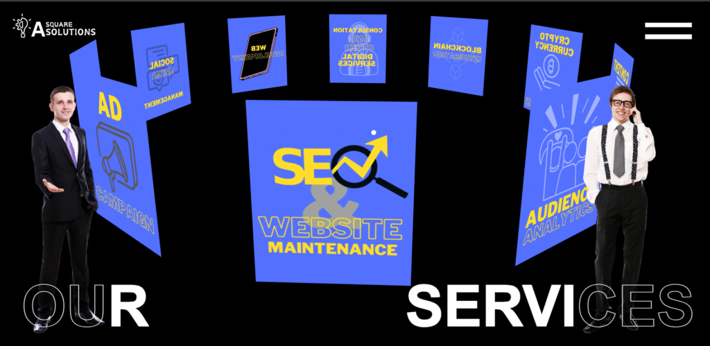
We designed and developed a clean, static HTML/CSS website to represent our company’s early offerings in digital marketing, AI, and software development. This version included multiple sections:
Custom navigation & hero banners
Service highlights
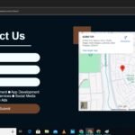
Contact form with mail integration
Scroll animations
Footer with quick links
What we shipped: features and craft
Our original site packed pragmatic features under a minimal shell:
Clean HTML5 structure and semantic meta tags for SEO.
Responsive grid layout built in CSS3 for a great mobile experience.
Custom hero and service sections to display capabilities.
A lightweight contact form with mail integration (no bulky CRM hooks).
Subtle scroll animations and in-page anchors for a polished feel.
The result was a site that looked larger than we were — a professional face to help win early clients.

Key Features Delivered
Clean HTML5/CSS3 Structure
SEO-Friendly Meta Tags
Responsive Grid Layout
Custom Font & Styling
Lightweight & Fast Loading
Easy to maintain
Challenges we faced (and how we solved them)
Going pure HTML/CSS isn’t without tradeoffs. We encountered three recurring problems:
Manual content edits. Without a CMS, every copy change required a developer. Solution: we modularized templates and used small includes to make updates easier.
No blog or dynamic content. Marketing demands change over time. Solution: we planned for migration by keeping content structured and using a consistent URL pattern.
Scalability. As offerings grew, so did the need for blogs, case studies, and easy content creation. Solution: we migrated to WordPress when content velocity became a priority.
These fixes are common — and they informed our decision to move to a CMS without losing the performance-first philosophy.
Challenges & Solutions
Challenges
No CMS (Content editing was manual)No blog integrationNeeded future scalability
Solutions
Used modular HTMLDesigned for performanceLater migrated to WordPress
When we moved to WordPress (following official WordPress migration best practices), we carried forward the things that worked:
The visual language and custom typography.
The mobile-first responsive grid and lightweight assets.
SEO-friendly structure and meta usage.
We added what our business needed next:
A blog for thought leadership and topical pieces (AI, agentic systems, product analysis).
CMS-driven page templates for rapid content creation.
Plugin-based integrations for analytics, forms, and backups.
The migration was not a rewrite of philosophy — it was scaling the same design values for broader content needs.
Even in a CMS world, the fundamentals matter — especially when building on modern HTML5 and CSS3 standards. Understanding HTML and CSS helps teams:
Build lightweight templates that won’t bloat performance.
Debug layout and accessibility issues at source.
Create design systems that translate cleanly into themes.
For agencies building for clients, that craftsmanship is a competitive edge.
Start with simplicity: launch fast, measure, iterate.
Keep content portable: structure pages so they can be imported into a CMS later.
Profile the real business need: if you need frequent content, choose a CMS earlier.
Don’t throw away craft when scaling — keep performance best-practices.
Many of these principles align with Google’s guidance on core web vitals and performance.
This first version helped us establish our online presence, onboard initial clients, and represent our design capabilities in a fast, code-driven manner.
If you want a lightweight, hand-coded starter site or a performance-first WordPress migration, we build both. Contact us for a free audit and migration plan.
Want a fast, clean custom-coded website for your brand?
- July 27, 2025
- asquaresolution
- 12:08 am
- July 27, 2025
- asquaresolution
- 12:08 am